Lakefront Digital started as a library conversation while studying. Hayden wanted to start a business, and I had an idea: bridge the gap between cheap AI-built sites that look like brochures, and full agencies that cost thousands and take months
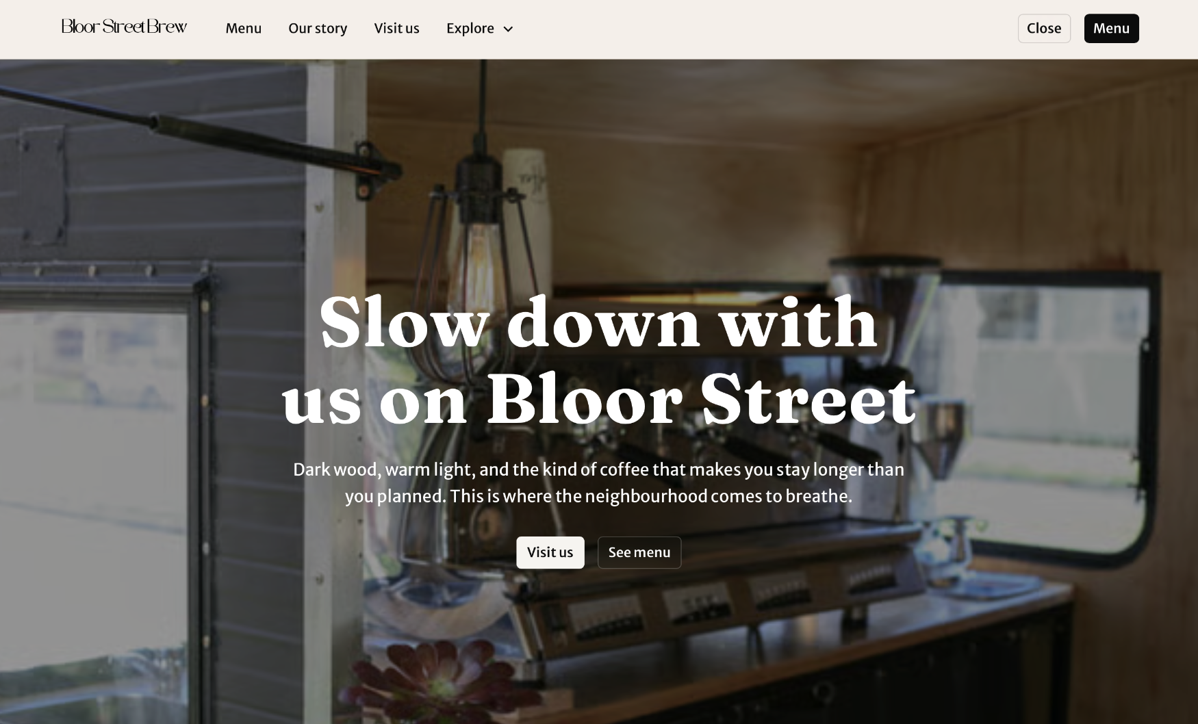
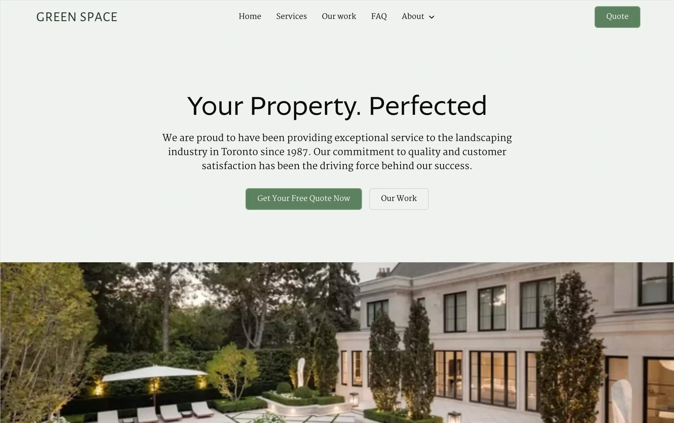
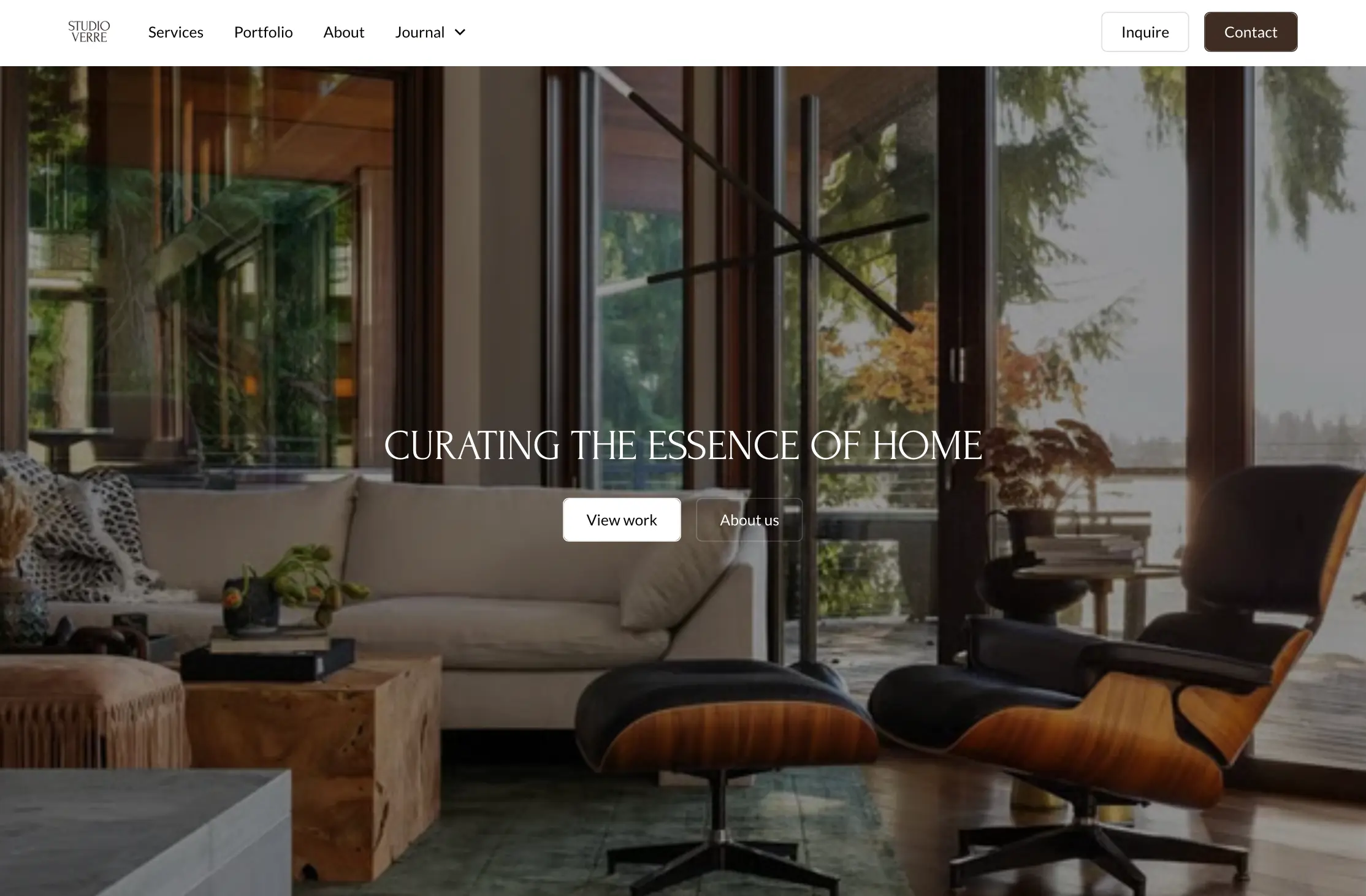
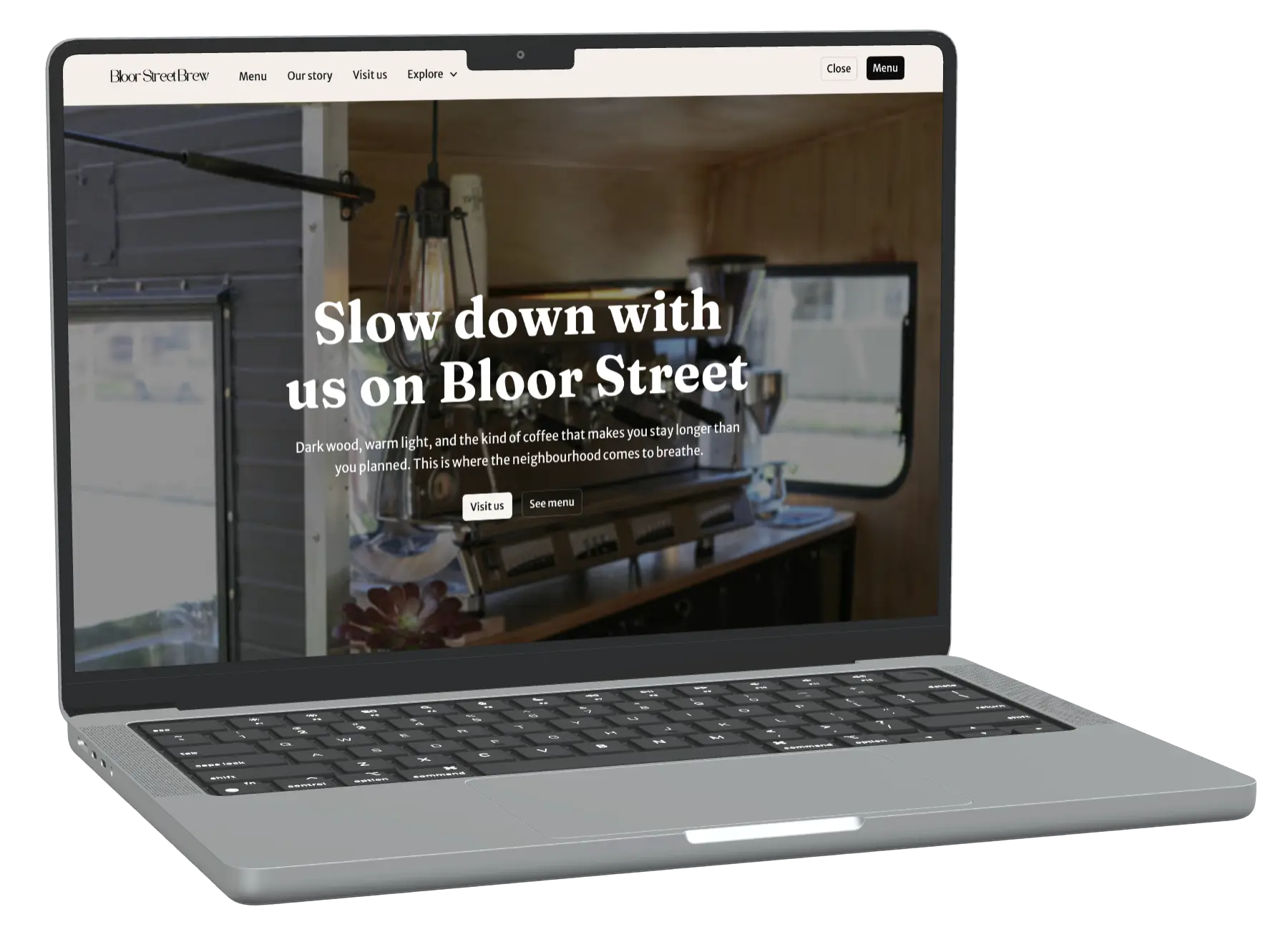
We use Relume to build the layout fast, then refine everything in Webflow with real animation and polish. That gets small local businesses a genuinely well-designed site in about a month, at a fraction of agency pricing.
I handle design and development at Lakefront Digital, from the first layout in Relume to the final build in Webflow. I've rebuilt our own site three times in the past six months, each version better than the last.
Once Hayden brings in a client, I walk them through our process and design the site myself, refining every layout, animation, and detail before it goes live. I learn by doing, and I don't stop until it's right.
I handle sales and client relationships at Lakefront Digital. I reach out to local businesses that don't have a website, and using what I've learned through sales training, I pitch them on what we can build for them.
Once a business sees the value, I set up a call between them and Finley and stay involved through the project. I'm heading into grade 12 and planning to study sales in university, so this is my way of building real experience while Finley and I split the profit from every project.