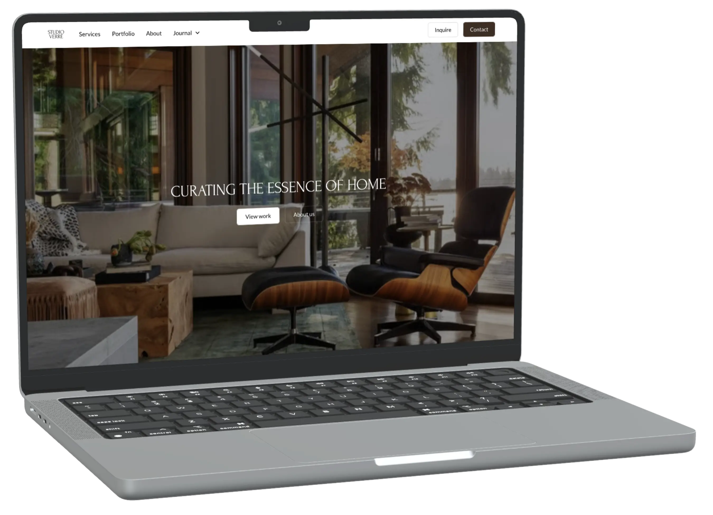
Design & Details
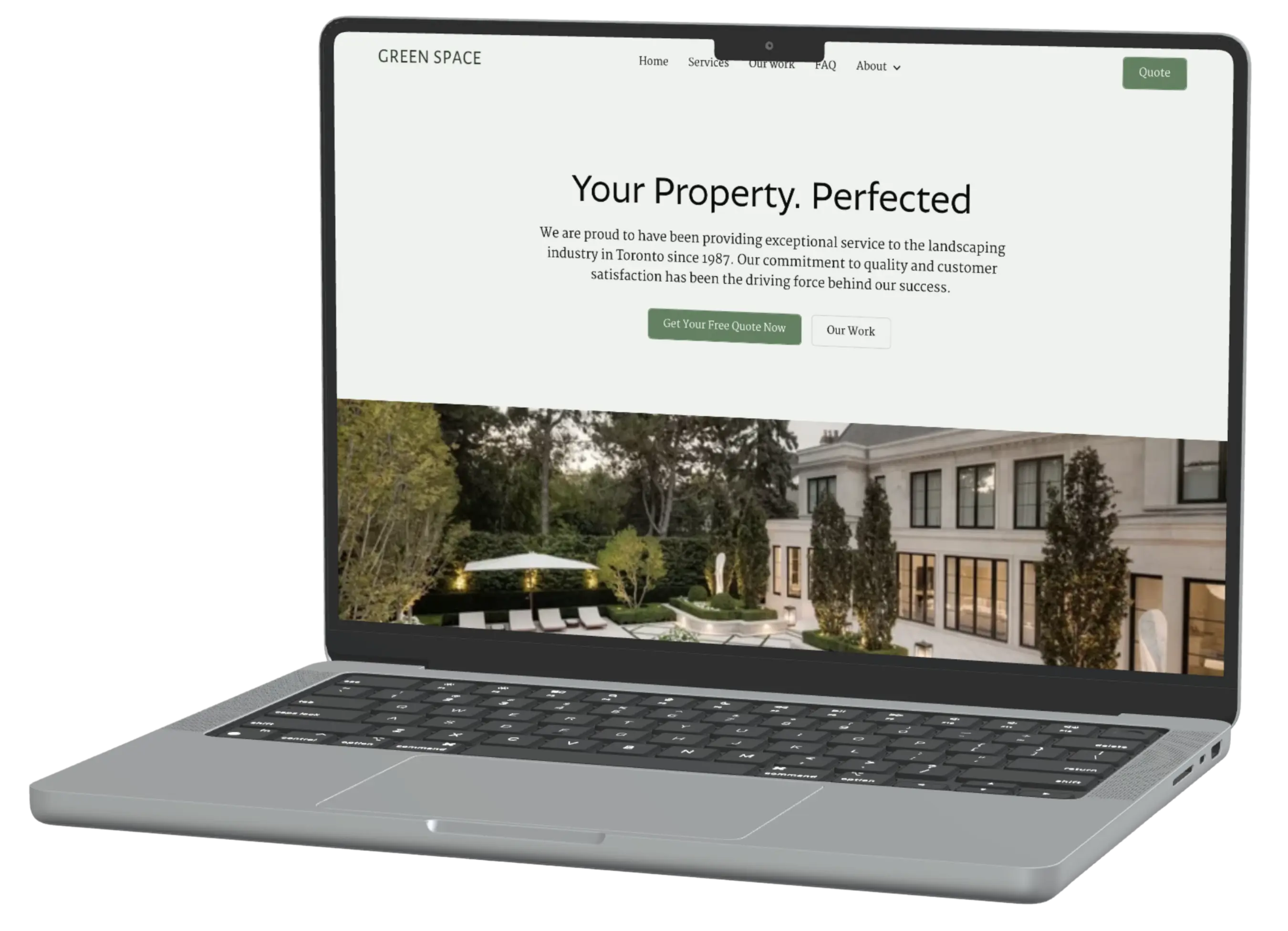
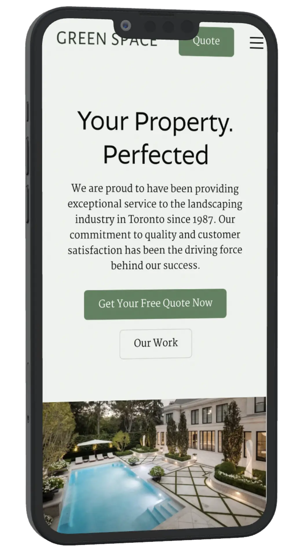
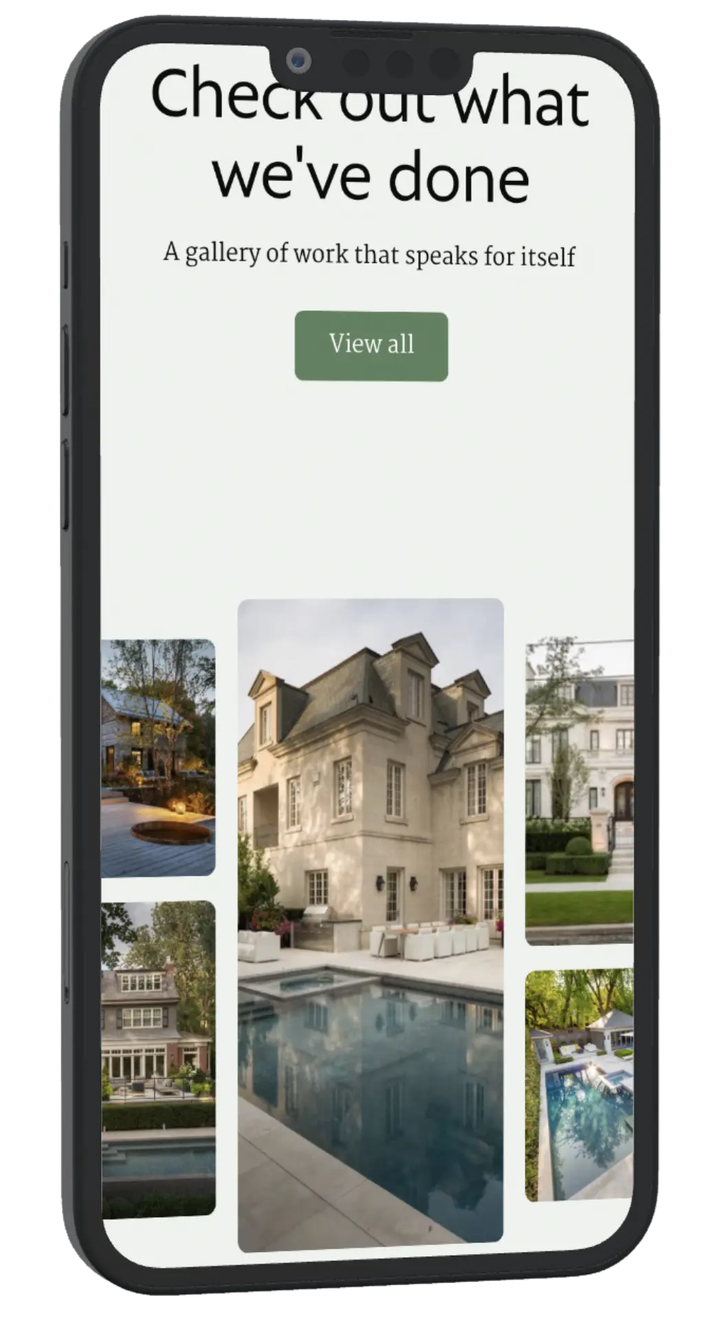
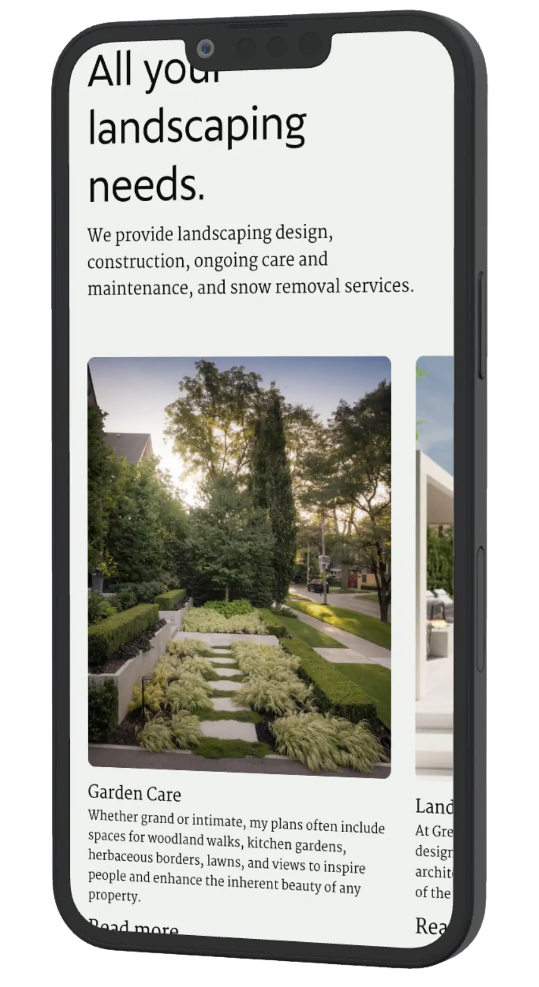
The palette, sage green and warm cream, was chosen to reflect the industry itself, calm, natural, and grounded, while the deep forest green in the buttons and accents adds the weight needed to feel premium rather than soft. Typography leans on a serif that reads as established and trustworthy, paired with clean sans-serif body text for clarity. The photography carries most of the weight here, so layout and spacing were kept simple and out of the way. Every section, from the service cards to the FAQ accordion, was built to let the properties speak for themselves.