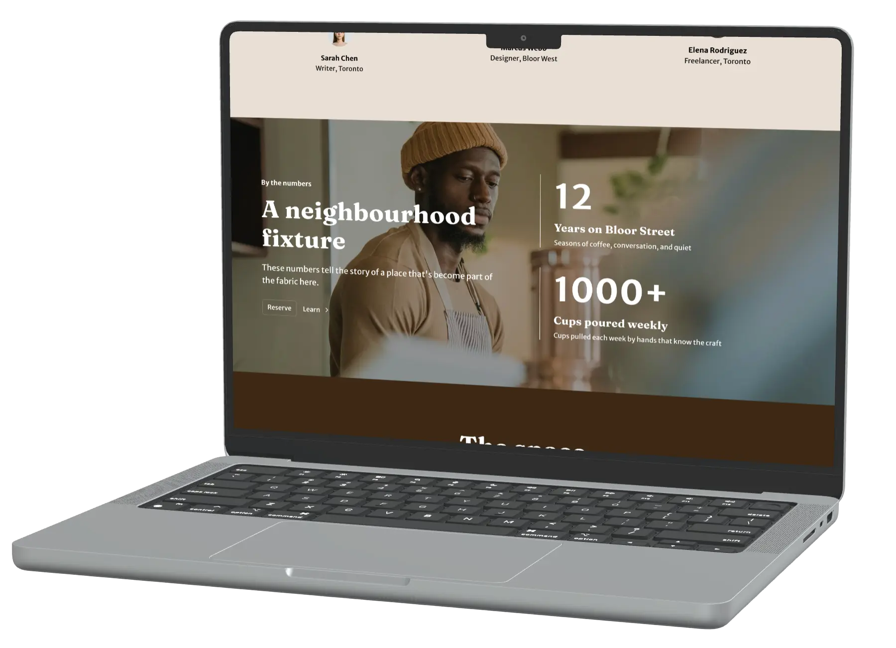
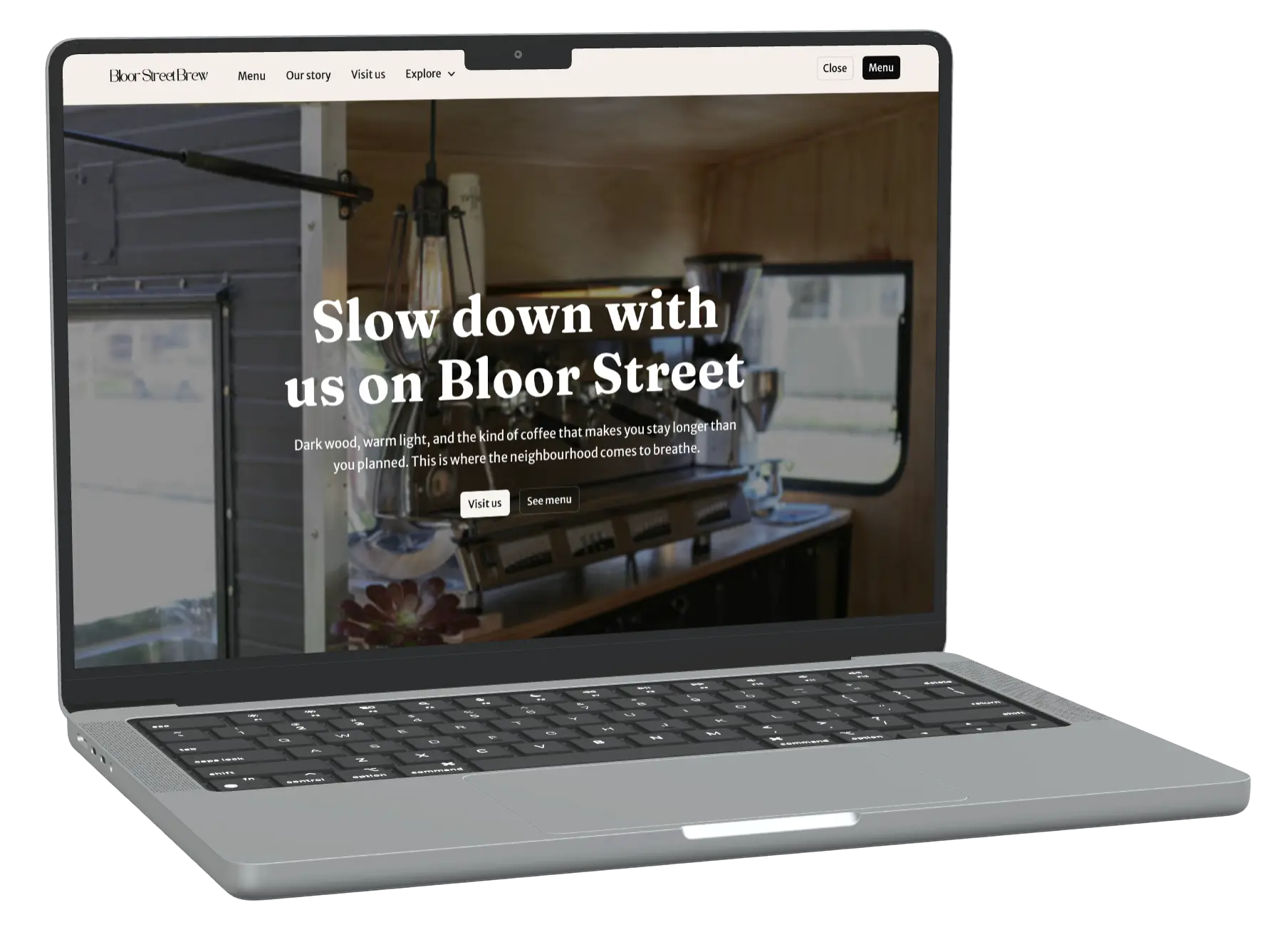
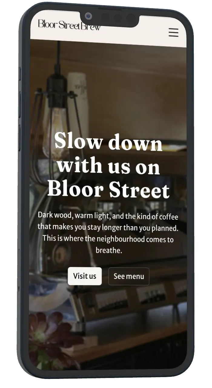
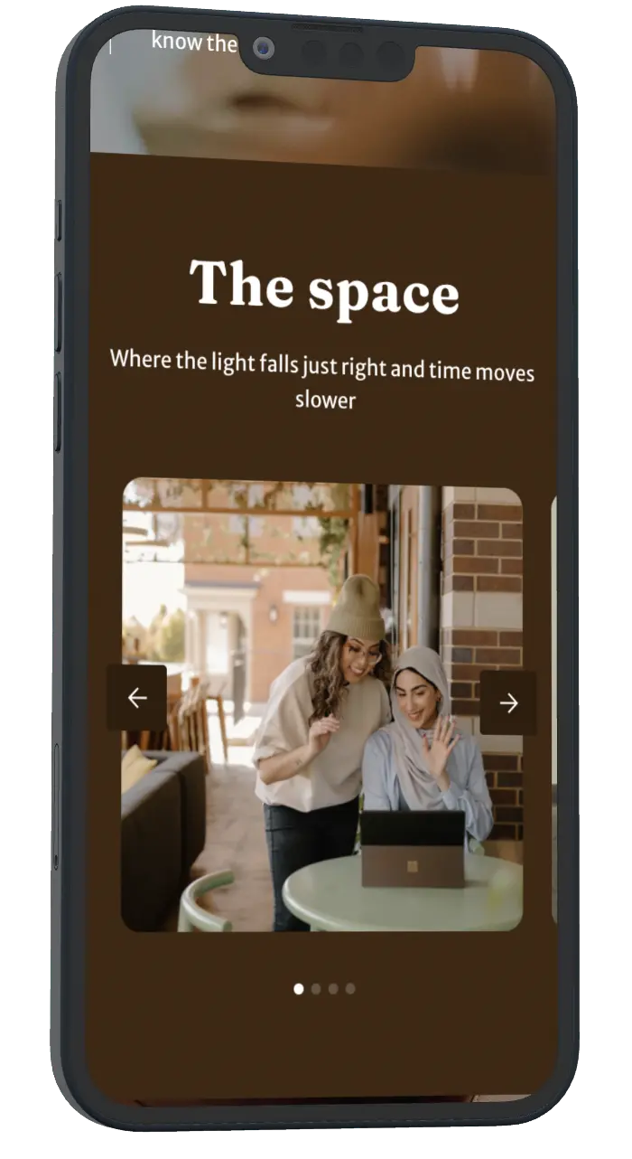
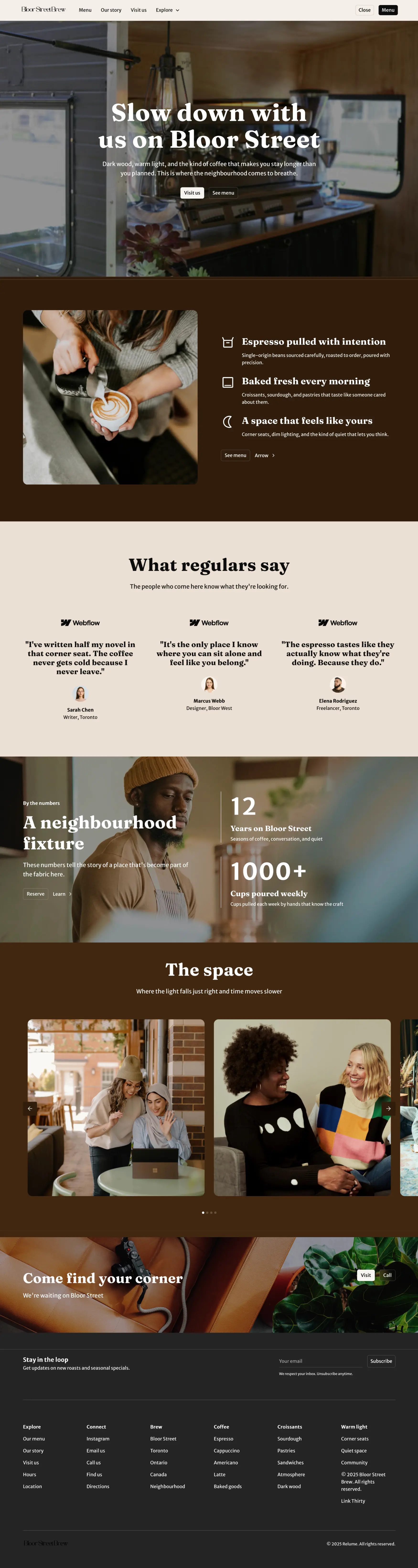
Bloor Street
Brew

[SCROLL]
Skip
 ↓

Overview

Bloor Street Brew needed a site that felt as warm and intentional as the café itself. A lot of cafés have websites that look like they were built in an afternoon, stock photos, a menu PDF, and a Google Maps link. This needed to be different. The goal was for someone who's never visited to land on the page and already understand the atmosphere, the quality, and the kind of place it is before they ever walk through the door

Design & Details

The palette,  deep espresso brown and soft cream, was pulled directly from the café's interior, not chosen from a mood board. Typography is set in a serif that reads as both established and approachable, and the spacing throughout was deliberate, built to feel unhurried. Page load animations bring the hero in with weight and intention, scroll reveals feel considered rather than automatic, and every button responds with a hover state that adds polish without being decorative for its own sake.

Mobile

Most people finding a café online are on their phone. Every section was built mobile-first: the layout, typography, and spacing all adapt so the site feels just as considered on a small screen as it does on desktop. Nothing shrinks awkwardly or breaks. The experience holds
Projects
Barbershop Tortonto